Hi everyone,
I would like to suggest an improvement for how Multi-Select Custom Fields are displayed in Testiny reports.
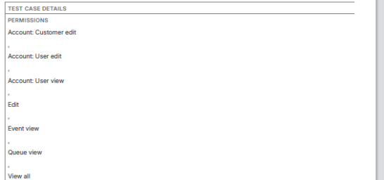
Currently, these fields tend to take up a lot of space (seee screenshot) —especially when multiple values are selected—which makes reports harder to read and increases unnecessary page length.
A more compact, space-efficient layout would be very helpful. For example:
-
Displaying values in a single line rather than multi-line blocks
-
Using separators such as commas, slashes, or small badges
-
Allowing an optional “collapsed” view with hover expansion
-
Reducing excessive padding or line breaks
This would greatly improve readability, particularly in larger reports or when exporting documentation for stakeholders or audits.
Is a more compact display format already planned, or could this be considered for a future enhancement?
Thanks in advance for any insights!