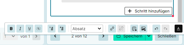
The “+” and “…” button covers some text when you click in a step and start writing straight away. It goes away if you move the mouse out of the step, but it’s an additional step and confusing at first.
Oh - yes, the story with the editor and the place where you place the editing bar…
The floating bar has pros and cons and it’s really tricky to find a way, where the bar is always where you want it, but does not block something else.
We will do our best to find a better approach; if you (or anyone else) has any ideas - we welcome any input.
Some comments on the mentioned points:
Agreed; maybe we can move the bar some pixels upwards.
That’s actually intentional - but we heard about this already a few times.
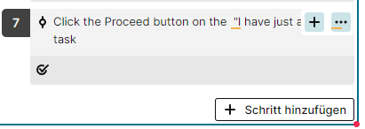
Any suggestions where we could place the buttons?
Oh – that looks like a bug; noted down - thanks for reporting.
Since i havent seen a suggestion for the second point:
What about not showing the buttons only on hover, but fixating them at the far right of the test steps for all steps.
alternatively, the buttons could be fixed on a single spot and always apply for the test step the user has currently selected (for that to make sense, it would require another feature that indicates more clearly which step is currently being edited)