(I’m not sure if this is a support issue or a feature request).
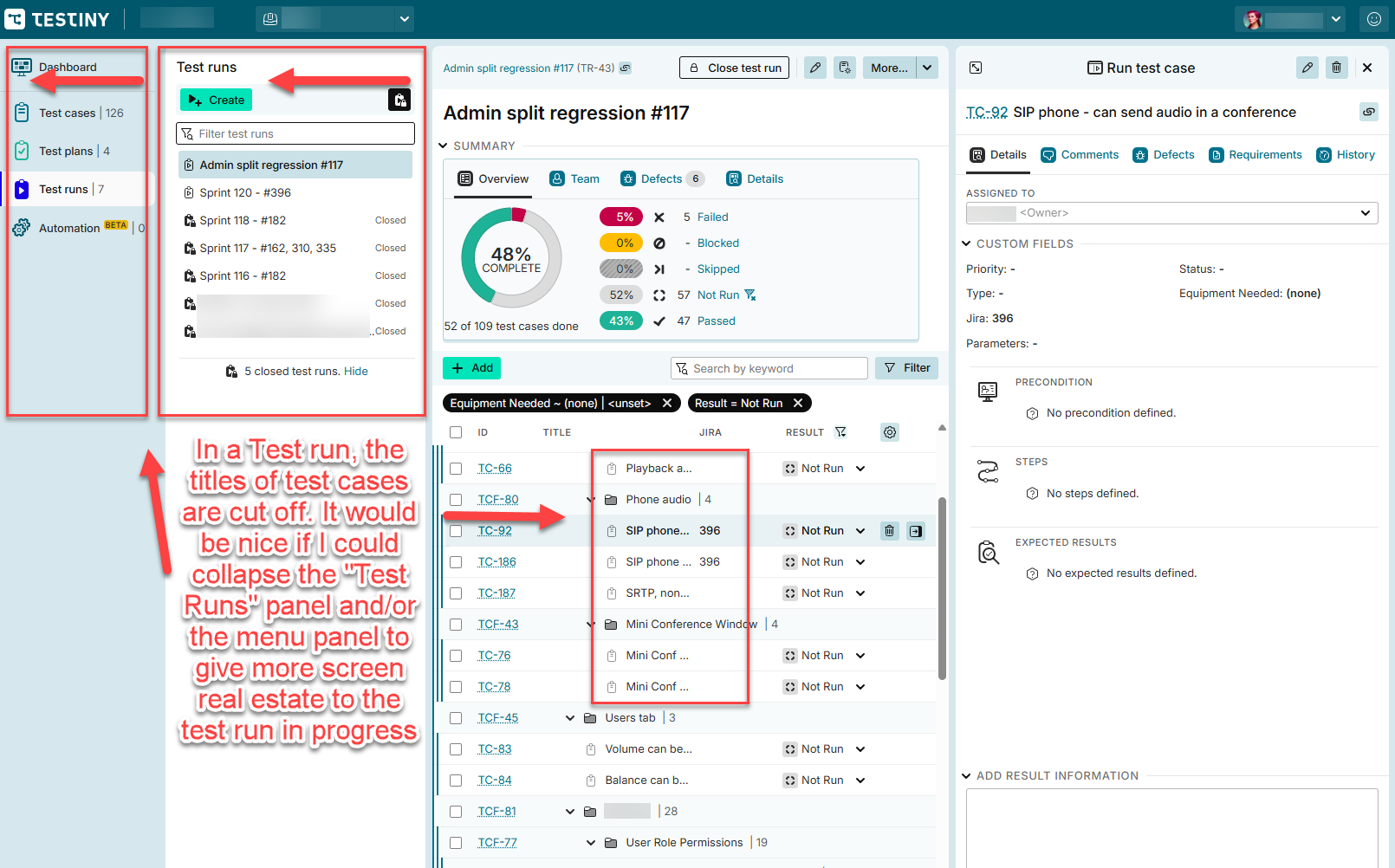
I’m finding it cumbersome to run Test Runs because I can’t view the names of my test cases without making my browser very wide. At a “normal” width - the left menu and the Test runs panel take up almost a third of the screen which reduces the usable space in the main area in which I’m working. I don’t want to close the test case detail panel as I use that while performing testing. See screenshot below.
Is there a workaround to collapse these panels? Or a feature request I can vote on? I searched but didn’t see anything.
Thanks!
Screenshot - test case titles are truncated very short while viewing test run.
Hi and welcome to the Testiny forum!
I can understand your problem, in fact we already have a revamp of the test run layout on our roadmap.
You can vote on this feature/topic - higher voted features will be prioritized.
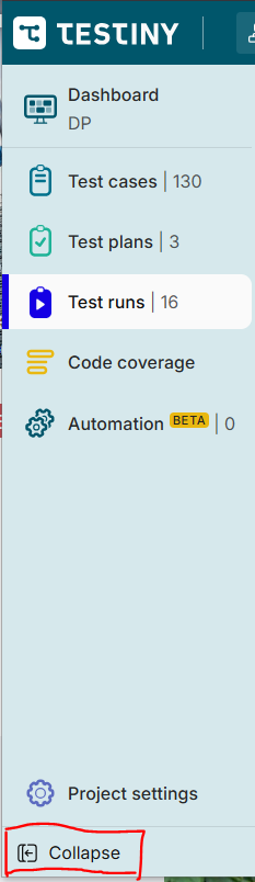
That said, you can already collapse the left side-panel:
And you can also resize the list of test runs, i.e. make it very thin using the drag handle between the test run list and the list of test cases.
Additionally, you can also show the currently selected test case in full-screen mode by clicking on the expand button:

That way, clicking on a test case will not show it on the right side, but enlarged. It’s a workaround, but maybe it helps 
Best regards,
Alex
Thanks for the quick reply! The tip about minimizing the Test runs panel is helpful and a good workaround for now.
Have a good one!