Hi and welcome to the Testiny forum!
I can understand your problem, in fact we already have a revamp of the test run layout on our roadmap.
You can vote on this feature/topic - higher voted features will be prioritized.
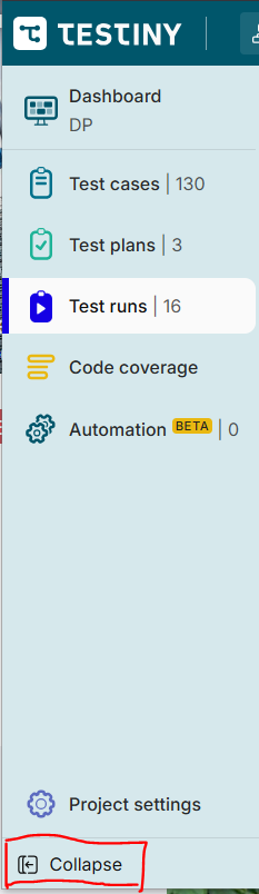
That said, you can already collapse the left side-panel:
And you can also resize the list of test runs, i.e. make it very thin using the drag handle between the test run list and the list of test cases.
Additionally, you can also show the currently selected test case in full-screen mode by clicking on the expand button:

That way, clicking on a test case will not show it on the right side, but enlarged. It’s a workaround, but maybe it helps ![]()
Best regards,
Alex