Hello, I’m a QA Manager, and we have adopted Testiny as a test management tool within our organization.
However, several of my colleagues have expressed concerns regarding the user interface and overall usability.
In particular, components such as the Sidepeek panel, the Left Navigation Bar (LNB), and the Table View are often cited as difficult to navigate.
Because the interface presents a significant amount of information and many interactive elements, users frequently need to reduce their browser zoom level to 70–85% in order to use the tool more comfortably on their laptops.
We hope that this feedback from actual users can be helpful in further refining Testiny’s interface and making it more intuitive and user-friendly.
Hello,
Is there any plan for update UI/UX? I feel a little uncomfortable with the layout where I can see the test case.
Hi and, first of all, thank you for your feedback!
As UI/UX can sometimes be subjective and hard to get right for everyone, it would be great to get more concrete information what your users find difficult to deal with, so some concrete examples with screenshots would be great ![]()
Additionally, could you give me some more information on the environment you’re using?
- screen resolution
- zoom settings
- language used
This information would really help us in determining the areas to improve. Thank you!
As stated in the following forum topic, we do plan to adapt the test runs page in the future - and I also stated some hints on how to better work with the current UI:
Best regards,
Alex
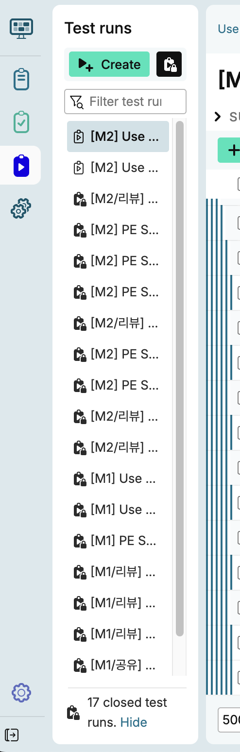
Thank you for the screenshot!
As already stated here, we do have a layout improvement for the Test Runs page on our roadmap.
This will in particular target the list of test runs, it’s usability and ability to filter test runs.
So thank you for your feedback! We will try to incorporate it when tackling the layout update.
Best regards,
Alex